Woodford Green, Essex
RIGHT TO BUY AND THE 'WORKING CLASS'
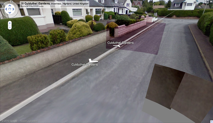
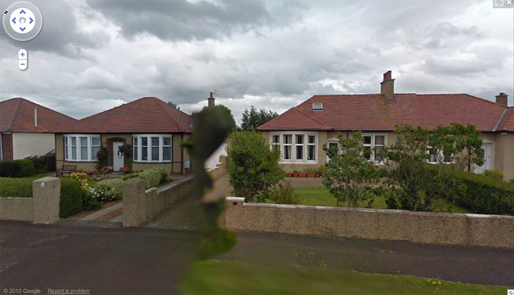
Until the housing bill of 1979 when Thatcher introduced the right to buy council houses, local authority housing estates were uniquely unchanging in appearance. Wilmott and Young (1967 p. 31) quote a 1960s resident of an estate in Woodford complaining of the strict controls – ‘you have to submit plans before you can even build a side gate.’ In a Guardian article headlined ‘30 years on, Thatcher’s revolution still divides the estates of Britain’, a resident of the Harold Hill housing estate in Essex recounts how from 1979 ‘There was a ceremony everyone seemed to have, where they would go out and change their old council wooden gate for a wrought-iron one. That was how they announced they’d bought.’ (Rowland to McVeigh, 2009)
De Botton (2007) mentions a group of houses which Le Corbusier, who went on to be regarded as the greatest Modernist architect, was commissioned by a French industrialist to design for his manual workers in 1923. De Botton describes the resulting buildings as ‘exemplars of Modernism, each a series of undecorated boxes with long rectangular windows, flat roofs and bare walls’, claiming that
Le Corbusier was especially proud of their lack of local and rural allusions. He mocked the aspirations of what he called the ‘folkloric brigade’ – made up of the sentimentalising traditionalists – and denounced French society’s intransigent resistance to modernity. In the houses he designed for the labourers, his admiration for industry and technology expressed itself in expanses of concrete, undecorated surfaces and naked light bulbs. (p.163)
A photograph of the same houses in 1995 shows them having changed almost beyond recognition, with decorative clay tiles on the roofs, painted shutters and small, multi-paned casement windows. As De Botton puts it, ‘unconcerned with spoiling the great architect’s designs they added...flowered wallpaper and picket fences in the vernacular style, and, once that was done, set about installing a variety of ornamental fountains and gnomes in their front gardens.’ (p.163)
Across Britain, working class estates have been transformed in similarly exuberant fashion. Even those who have not had the means or desire to purchase their homes have found ingenious ways of moulding exteriors to their tastes; as well as on the Excalibur, adhesive lead applied to the inside of windows in the form of cottagey diamond panes is rife in the1960s-70s brutalist Aylesbury Estate, also soon to be demolished. A block at Havil Street, Camberwell until recently hosted a maisonette whose proclaimed itself to be Celtic Park, with green and white striped window boxes.
An early 1980s photograph in The Design of Suburbia (Edwards, 1981) shows a terrace of red brick municipal houses, with twelve-paned sash windows in the neo-Georgian style. On one house, clearly ‘bought’, these have been replaced with large picture windows and decorative shutters, but the vaguely Arts and Crafts wooden canopy has been replaced with a triangular pediment and Doric pilasters, in the Georgian idiom. In the context of this, it appears almost perverse to have replaced the windows: must we assume that signalling one’s freeholder status is more important than any commitment to a style?
In ‘The Aesthetics of Social Aspiration’ Clarke suggests that the notion of ‘keeping up with (or preceding) the Joneses’ with displays of overt material wealth is too simplistic, claiming that, amongst the working classes, ‘in accordance with historical traditions there is almost no actual visiting of neighbours.’ (Miller, 2001 p.29) However, with exteriors this becomes irrelevant, as we do not need to cross the threshold to be able to covet the neighbours’ new windows.
To return to the houses at Pessac, on the assumption that they echo British council estates (many of which were designed by Le Corbusier’s disciples) in some respects, De Botton (2007) evokes the tenants’ working life spent in ‘concrete hangars ... assembling pine packing cases. At the end of a shift, to be reminded of the dynamism of modern industry was not a pressing psychological priority’ (p. 164), hence the traditional, vernacular and more elaborate details they chose to add to their exteriors: anything to affirm their individuality and rooted past. Crucially, De Botton suggests that for both the occupants and the architect, the motivation was the same: ‘just like Le Corbusier, the tenants had fallen for a style evoking the qualities with which their own lives had been insufficiently endowed’ (p.166), Le Corbusier having rejected a life of ostentatious wealth and privilege.
It is interesting to compare this idea to one expressed by Barthes (1993) in Ornamental Cookery, where he examines the complicated dishes, ‘the very dream of smartness’, presented in Elle, which in 1950s France was a magazine aimed at a working class public. Barthes describes it as ‘a cookery based on coatings and alibis, forever trying to disguise or extenuate the brutal primary nature of foodstuffs’. This
ornamentation proceeds in two contradictory ways – on the one hand, fleeing from nature through a kind of frenzied baroque...and on the other, trying to reconstitute nature through incongruous artifice (strewing meringue mushrooms and holly leaves on a log-shaped Christmas cake or replacing the heads of crayfish in a pattern around the sophisticated béchamel which hides their bodies). (p. 78)
This description strikes a chord; I am reminded of the imitation stone cladding that sometimes covers local stock brick on small Peckham terraces and the resin squirrels attached to mock half-timbered Excalibur prefabs.
He believes that because Elle is addressing a genuinely working class public, paradoxically it goes to great pains ‘not to take for granted that cooking must be economical’ (p.78), in contrast to the middle class L’Express which gives recipes for (simple) salad Nicoise. It is the food equivalent of the working or lower-middle and middle or upper-middle classes’ respective preferences for ornamental plastic urns or plain, patinated terracotta pots, and UPVC front doors incorporating imitation stained glass or solid, unadorned wooden ones.
This dovetails with Barthes’ (1993) essay on Plastic, that material now so beloved of the masses for low-maintenance window frames, cladding, fascias and porches, sometimes in imitation woodgrain. Writing in 1957, he suggests that ‘plastic highlights an evolution in the myth of ‘imitation’ materials”, which are ‘historically bourgeois in origin.’ It is, he says,
the first magical material that consents to be prosaic ... With plastic, objects will be (made) for the sole pleasure of USING them. The hierarchy of substances is abolished, a single one replaces them all - the whole world can be plasticized. (p.97)
Conservationists would shudder at the thought.
THE URBANE AESTHETE’S APPROACH
In The Freedoms of Suburbia, Barker (2009) reveals that when he was looking to buy his first house, in Kentish Town, north London he
was determined that it would be in the flat-fronted, Georgian style: the kind that Modernists approved of ... My first step in gentrification was to root up the privet in the tiny patch of front garden and to chip the enamelled name, ‘Bowerhayes’ off the glass panel above the front door ... Now the house could take its place as truly urban, even semi-Modernist. (p. 9)
It is not clear when exactly he carried this out but as Cooke’s (2009) Observer review points out ‘He also bricked up any remaining fireplaces, which gives you an idea of how long ago this must have been.’ So much interwar suburbia was built in the ‘Tudorbethan’ vein because it was as distinct as possible from the styles used for local authority housing. Conversely, this story shows the lengths the ‘design-conscious’ would go to to avoid their house looking ‘suburban.’ Presumably Barker was buying when Modernist council blocks were still causes celebres.
Suggesting that this attitude was prevalent at least among an urbane middle class, Cooke corroborates Barker’s anecdote, citing a time when the academic parents of a boy she admired named Crispin purchased a flat-fronted house in the centre of Sheffield – ‘thus, in one fell swoop, I became an unsuspecting modernist ... years later, when a girlfriend told me how little she cared for bay windows, I managed not to say: But they allow such a lovely feeling of space and light!’
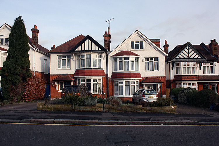
Today, a glance at Choumert Road, Peckham betrays the enduring impact of these views. These pictures are of adjacent blocks, but the striking contrast between them is not just in terms of the original style of the architecture. Though at some point in their lives they may have been considered slums, and one in an adjacent street still harks back to earlier trends in home improvement with its square interwar bay window, the flat fronted early Victorian houses - ‘semi-Modernist’ or almost Georgian, depending on your preference - are immaculately maintained, with matching paintwork and no added decorative flourishes, perhaps apart from ‘contemporary’ chrome door furniture. The later Victorian bay-fronted houses, until relatively recently written off as mean and ugly (including in a 1960s Ladybird children’s title I grew up with, The Story of Houses and Homes; (Bowood, 1963) indoctrination started early) and therefore not worth preserving, now display a wide range of frontages, with a variety of windows and examples of roughcast and ‘stone’ clad walls. The owners of this formerly bay-fronted house opposite Sophie’s obviously took the flat-fronted mantra to heart.
Of course, it is likely that in the future the entire street will become uniformly ‘gentrified’ and in areas of London considered more salubrious, this has long since happened, though certain types of house are treated with less reverence. A Guardian interiors spread featuring an Edwardian semi in north London (14 November 2009) opens with ‘Dropping round with a bottle of wine is one way of getting to know the neighbours, but painting your house black has much the same ice-breaking effect.’ (Simon, 2009) The exterior indeed shows a black-painted house adjoining a more sedate one, and an original front door whose stained glass has been replaced with frosted. The owner is quoted as saying ‘I would never have painted a brick Victorian place, but this is a kind of run-of-the-mill house, so I could afford to be more adventurous.’ (Barron to Simon, 2009) Presumably this was the mentality that informed the owners of the house on Ferndene Road when they opted to transform its appearance so radically.