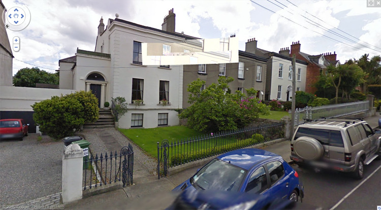
>

Tuesday 29 November 2011

SIX EIGHT KAFE


I drew on these stickers for a project Craig at Birmingham's SIX EIGHT KAFE came up with, involving illustrators and designers creating self-promotional labels to spice up the cafe's takeaway coffee cups. I like the idea of each cup being matched to a customer.

Friday 11 November 2011

NO WAISLEY!


I have two pieces (below) in the Scottish Drawing Competition exhibition at Paisley Museum (above) right now. You should read about the PAISLEY WITCHES. Christian Shaw is a cool name for a 17th century 11 year old girl.


Saturday 29 October 2011

EXTERNAL VERITIES: PART 5


Sydenham Hill, London

EXTERNAL VERITIES: PART 5
THE VALUE OF DIVERSITY

Are these myriad expressions of individual taste a good thing? Le Corbusier (1963) would not have thought so. He advocates ‘uniformity in detail and variety in the general effect (the exact opposite of what we do today: a mad variety in details, and a deadly uniformity in the setting out of our streets and towns.)’ (p.214), the latter a description that we can imagine being applied to much of south-east London. Edwards (1981) takes a similar view, opining that ‘Whatever may be the social, economic or political benefits of [right to buy], the effect on the environment of municipal suburbia has certainly been disruptive.’ (p. 207) because individual changes can spoil a carefully planned design. However, his view of speculative suburbia is so dim that he believes that here it scarcely matters because ‘the appearance of the place is so restless that such changes are scarcely noticed in the jolting irregularity of the scene.’ (p. 207)

Le Corbusier (1963) longs for a situation where the prefabrication of basic components meant that there is ‘some sort of link between the rich man’s house and the poor man’s’ (p.217) and
A house will no longer be ... an expensive luxury by which wealth can be shown; it will be a tool as the motor-car is becoming a tool ... an aesthetic of its own results from the method employed, and to use the resources of the modern industrial “yard” to advantage demands the exclusive employment of straight lines, square-set ... We must clear our minds of romantic cobwebs. (pp. 220-221)
However, this is all written from a privileged viewpoint and the functionalist rhetoric is superficial: so a rich man’s house might be made to look a bit like a poor man’s house and vice versa, but it is still a capitalist approach.

Also, Le Corbusier’s ‘machine aesthetic’ is every bit as romantic as one which advocates reconstituted stone wishing wells or animal topiary. De Botton (2007) describes his celebrated Villa Savoye as an ‘artistically minded folly.’ (p.68) Its flat roof, insisted on by Le Corbusier despite his clients’ requests for a pitched one, may have looked efficient and utilitarian but it leaked so much that the clients’ son caught a chest infection which led to pneumonia. The house was uninhabitable.

Lefebvre’s view is very different. Merrifield (2006) describes his feelings of unease in the Modernist new town of Mourenx, reminiscent of the Pessac houses prior to their transformation or a lower density version of the Aylesbury Estate upon completion: ‘Its physiognomy is left naked, robbed of meaning, ‘totally legible’ ... a stripping process has been accomplished.’ (p. 63) Lefebvre asks “Are we entering a Brave New World of joy or a world of irredeemable boredom?” (Lefebvre cited in Merrifield, 2006 p.63) Although he says he cannot give an answer, the subtext implies that he leans towards the latter. This is a place in which there is ‘no romance around any corner . What’s there is simply there.’ (Merrifield, 2006 p.63) And what’s there excludes castellated semis, stone cladding and maisonette exteriors resembling football clubs. ‘In the street disorder lives, it informs, it surprises’ (Lefebvre cited in Merrifield, 2006 p.91); ‘this disorder constructs a superior order.‘ (Merrifield, 2006 p.91) Brand (1997) believes that ‘the most interesting period for a building is between creation and demolition or preservation - when it’s changing’ (p. 10), quoting Eno: “humans have a taste for things that not only show that they have been through a process of evolution, but which also show they are still a part of one. They are not dead yet.” (Eno cited in Brand, 1997 p. 11)

CONCLUSION

I have presented a subjective snapshot of the public face of a selection of ‘ordinary’ houses in south-east London, and attempted to explore some of the possible factors that may have led to them looking the way they do right now. However, when operating in the realm of taste there is simply no room for rigorous objectivity. The DIY store coach lamp by the front door might imply that the householder harbours a longing for a mythical past, conceived as a Dickensian Christmas card, or it may just mean that he needed a light by which to see his keys, and his brother-in-law had this old one lying in the garage. Some people, as we have heard, are quite clear about what they are projecting when they paint that garden gate or rip out those hybrid tea roses, whereas others claim it is irrelevant, having no bearing whatsoever on them as an individual. And even the most dedicated DIY enthusiast will never fully erase the presence of previous inhabitants; every house ever built is destined to become a palimpsest.

Ultimately, attempting to find a correct approach is futile in the post-post-modern age. Some questions evade definitive answers. What is good taste in design that goes beyond the merely utilitarian? A combination of snobbery and oneupmanship? One might replace the picture window with a more authentic leaded one, but it then plunges the interior into stygian gloom. Which is better? It is impossible to say.

So is there value in this diversity of approaches? Our built environment as it stands may well be the construct of successive phases of capitalist hegemony, but in the era of post-industrial consumer capitalism, state planning for the ‘common good’ is probably not the answer. While those of us who may like to regard ourselves as socialists deplore a perceived lack of imagination in contemporary speculative developments and bemoan the lack of decent, affordable municipal housing, we still have no desire to be told what colour we must paint our front door.

Lefebvre (cited in Merrifield, 2006 p, 62) said that ‘the anthrope (sic) should always fight against a plan of logic, of technical perfection, of formal rigour, of functions and structures.’ In south-east London’s ouevre of exteriors, that fight is evidently ongoing. So much has been made of England's innate affection for individualistic domesticity at the expense of urban interaction. Perhaps the expressive range of these terraced facades combines the best of both.

Thursday 27 October 2011

WHITECRAIGS NIGHTS


Whitecraigs Nights
acrylics, chalk, pencil and paper

Saturday 1 October 2011

PROPERTY, PORN


I'm wary of posting too much work in progress because I don't wanna be one of THOSE internet ppl who continually allude to things that never materialise (hiya 28 DRAWINGS LATER) but here's some anyway.


A reject


I don't think it's any secret that I'm obsessed with houses and out of the many estate agents' websites I wistfully trawl THE MODERN HOUSE is probably the dreamiest, both in terms of the photography and layout and the houses they market. It's mainly geared towards SE England however and the asking prices are mental, but I've come across a couple of diamonds in the rough of Scottish property sites, which seem like incredible bargains by comparison (I obv speak as someone who lives out of the bottom end of their overdraft but you know, one day).


CALDERSTONE HOUSE by East Kilbride 'is a unique B listed 1960s designed house by the renowned architect Robert Steedman' and the multi-level studio looks magnificent. Having checked it out on a map it looks like it might be in danger of being engulfed by industrial estates and retail parks, but I kind of like the idea of having that as Ballardian inspiration in contrast to your Arcadian 7 acres of private woodland.


TOWNHEAD STEADING in East Saltoun dates from 1973 and is by Andrew Renton, and again has a nice studio. It looks like they've gone overboard with the white paint to give it a kind of BoConcept-type makeover and it'd be interesting to see it in its original state, though I'm really into the tiled floors and built-in furniture.

Friday 30 September 2011

EXTERNAL VERITIES: PART 4


Sydenham Hill, London

THE CONSERVATIVE APPROACH

In recent decades, numerous books have appeared aimed at the middle classes and their ordinary ‘period’ suburban homes, including even the much maligned Tudorbethan semi. In a way this seems like a democratization, but they tend to advocate a didactic conservative or restorative approach to house exteriors; evolution is frowned upon. Houses of Britain - The Outside View, (Prizeman, 2007) with a foreword by the Duke of Gloucester, is one example. The human allusion is made again - ‘the face of the house is the face of the [person] it was built for’ (p. 8) - but, rather than suggesting that this face should adapt itself to changing times, perhaps accessorising with a new door or paint colour in the way one would add some earrings or this year’s shade of lipstick, it is claimed that ‘to destroy or change the face of a house is to lose or alter exact evidence of the past.’ (p. 8) The Duke, in a rebuke to all aspirational homeowners who would dare to add a triangular pediment or faux-leaded panes to their little houses, helpfully points out that ‘After all nobody’s fooled if you put a Rolls Royce bonnet on a mini.’ (p. 7) It is difficult to read this as anything other than a yearning for a past where the proletariat knew their place and were content with it.

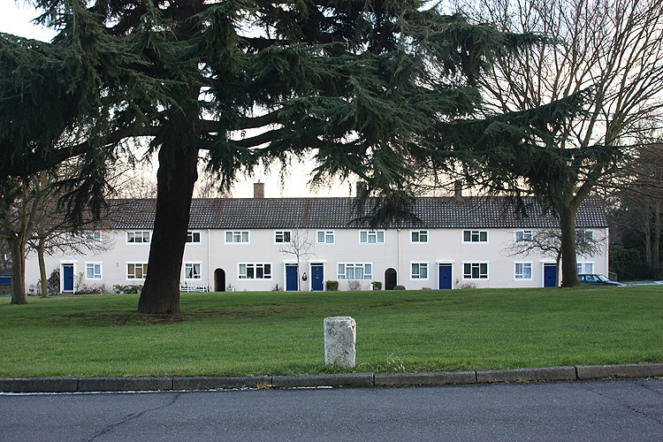
Barrett and Phillips’ Suburban Style (1988) contains a kind of rogues’ gallery of good houses gone bad, with captions like ‘A basically unassuming house has been turned into an eclectic nightmare’ (p.190) underneath a photograph of a modest dwelling with a particularly elaborate Italianate balustrade. Another image shows two houses in a terrace, one with its timber casements, porch and front door all intact, the other comprehensively endowed with aluminium picture windows; it bears the legend ‘A well-restored small Edwardian house contrasts with its sadly transformed neighbour.’ (p.197) But would the approved house’s poignant beauty not be diminished if the threat of the double glazing salesman was not always hanging in the air? De Botton (2007) writes about how glimpsing a beautiful stranger in the street makes us feel sad, partly because we may not possess them but also because we know that such beauty has a finite lifespan. Is this not part of the attraction to a perfectly preserved house? And will the authors feel the same if, in the future, someone chooses to replace the plastic garage door of a ‘noughties’ estate house with a timber one?

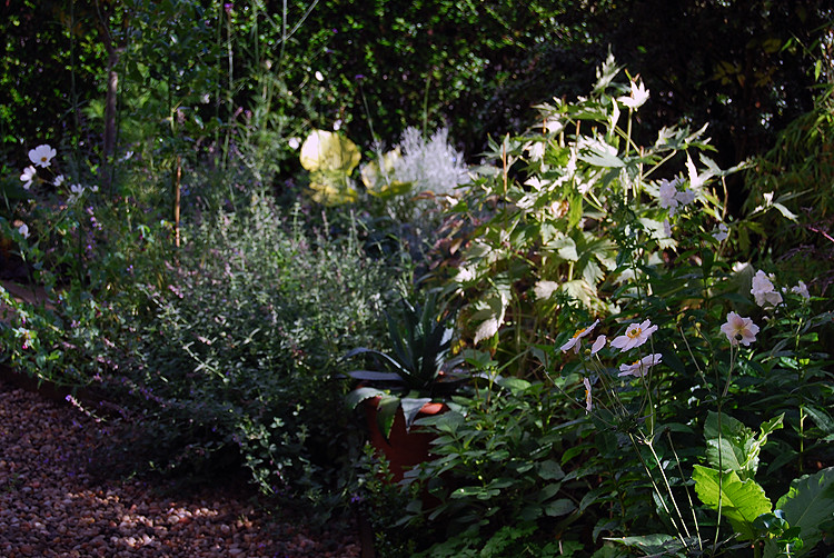
Front gardens too can be revealing about people’s aspirations. In Bartholomew’s (1998) Mitford-aping Yew and Non-Yew, he describes the upper-class garden:
The formal lines are often marked by hedges - frequently yew for the high ones and box for the low. Within the borders, species plants or old varieties are preferred; they are considered more "natural". Their names are preferred, too. Rosa 'Comte de Chambord' is more welcome than Rosa 'Bobby Charlton' or 'Sexy Rexy' (p. 32)

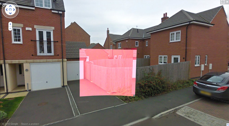
Box in particular is widely used an urban expression of affluence. To the untrained eye it may resemble weedy privet, but it is slow-growing, and therefore expensive. I surveyed the front gardens in the section of _____ Street including Julia’s house whose residents (at least in terms of property values) might be considered middle to upper-middle class and found that eight out of the twelve contained box. Incidentally, an acquaintance recently mentioned telling her mother that she liked magnolia trees, and her rebuke was that magnolias are ‘suburban’. In this context, ‘suburban’ could well be substituted with subhuman.

The East Dulwich Forum, serving the formerly lower-middle class district now synonymous with ‘yummy-mummy horrors’ (Dyckhoff, 2010) and famed for its purveyors of Cath Kidston-type idealised Englishness, contains some intriguing insights into its residents’ values. bigbadwolf chastises another forum user, Woof:
I bet you're one of those attention seeking imbeciles that festoons their property with gaudy christmas decorations aren't you Woof. I bet your house looks like something you'd find in Basildon doesn't it, you new money mincer! (East Dulwich Forum, 2009)

He then goes on to suggest Woof probably had Scottish parents, but the key citation is Basildon. To certain members of the urban middle classes, garish Christmas decorations aren’t just signs of new money, but of an inferior, suburban or ‘exurban’ (and worse, Essexurban) attitude.


TASTE AND THE PROBLEMS WITH READING IT


It is important at this point to think about the notion of kitsch. The Modernist view was that kitsch was something pleasurable that was too easy, perhaps something that ‘strives for an effect at odds with its true and proper purpose.’ (Bayley, 1991, p.103) Garden gnomes, plastic butterflies, the christmas decorations bigbadwolf so objected to, fake half-timbering and Bill’s tiled front garden could all be cited as examples of it. Greenberg compares the ‘kitsch’ of Repin to the real art of Picasso. The kitsch can be enjoyed without effort but the ‘peasant’s’ circumstances ‘do not allow him enough leisure, energy and comfort to train for the enjoyment of Picasso.’ (Harrison & Wood, 1992, p 539)

It is less useful to think of taste in terms of the way things look than as a product of the ideas that brought them into existence. In attempting to understand taste, we cannot attempt to judge the form, a matter of design, objectively. The predominant contemporary stance is that no style is intrinsically better and that ‘perfect art is possible in any subject matter or style.’ (Gaut & McIver Lopes, 2008 p. 389) We must instead study the spirit that gave rise to it. An individual’s taste is ‘utterly dependent on ideas of consumption fostered in industrial and post-industrial cultures’ and we, consciously or otherwise, reveal ourselves through our consumption. ‘If good taste means anything, it is pleasing your peers; bad taste is offending them...taste is more to do with manners than appearances. Taste is both myth and reality; it is not a style.’ (Bayley, 1991 p. 61)

De Botton’s explanation for the peculiarities of taste is simple: ‘What we seek, at the deepest level, is inwardly to resemble, rather than physically to possess, the objects and places that touch us with their beauty ... We respect a style which can move us away from what we fear and towards what we crave.’ (De Botton, 2007 p.152) In a harsher past of greater social unrest, ornate, sophisticated styles were favoured by the elite. Then, having had their fill of luxury and ease, they wanted something more elemental: unadorned concrete walls, minimalism.

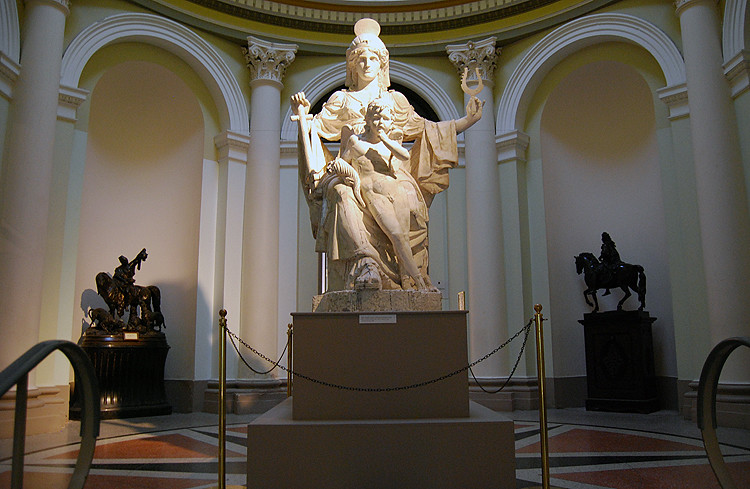
Nonetheless, it is dangerous to rely too heavily on this as a formula. Taste which is too ‘good’ can be read as a sign of conformity and insecurity. It is what George Bernard Shaw described as a kind of ‘moral cowardice.’ (Bayley, 1991 p.67) And of course, as Dorfles (1969 cited in Bayley, 1991 p.67) noted, the meaning of a kitsch object (for example) can be transformed in a cultivated setting. Think of that notorious icon of front garden kitsch, the gnome: Philippe Starck reappropriated it in stool form for Ian Schrager's Saint Martin's Lane Hotel, a regular in articles about so-called ‘hip hotels’. The stools are described as being ‘very special characters that are striking on account of their originality and non-conformism.’ (Exit Art, 2010) Would anyone think this if one were placed in a rockery in the crazy paved front garden of a 1930s semi?

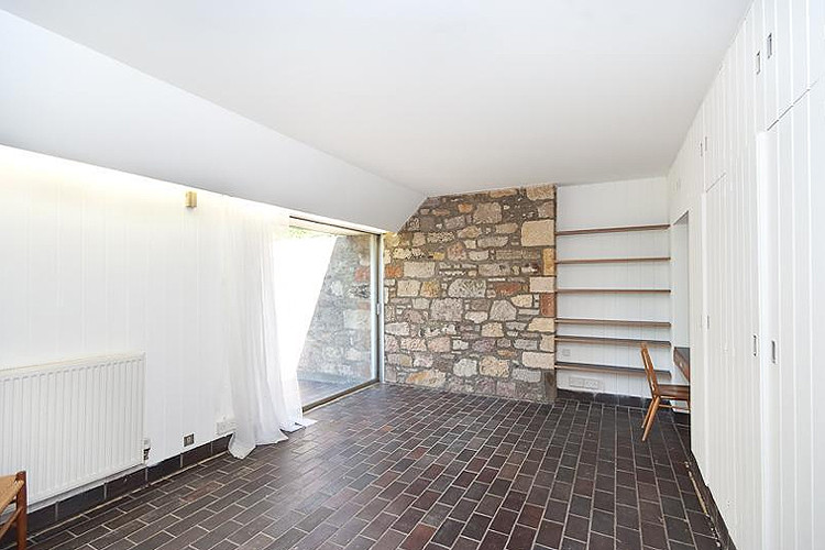
There is a house on Bushey Hill Road, Camberwell, which has a full compliment of the usual urbane accoutrements: refurbished sashes, a front door in a shade of teal verging on grey, standard olive trees in pots. It also has an illuminated number in its fanlight, in strident blue neon of the type more associated with signs for cheap barbers and greasy spoons. In this context, it is clever, knowing, a bourgeois creative injoke; it is like an art student from Primrose Hill experimenting with Kappa sportswear.

The notion of the paradox of consequences comes into play as well - an action can often produce an outcome diametrically opposed to that which was originally intended. Imagine ‘Joe Public’ wins the lottery and so wants a house that is extremely classy, its pediment and fountain smacking of the landed gentry. He instructs architects and designers and ends up with something that to the ‘cultivated’ eye is nouveau riche, crass and trite, exposing him for what he always was.

Thursday 8 September 2011

CRAFTED FOR THE EXECUTIVE MIND


(i) In my 'studio'


(ii) In the garden this morning. I'm into gardening a lot and I keep thinking about the virtual garden design program I had as a teen and its singular inappropriateness for rendering plant life. I'd like to make a garden that looks exactly like the one below - which actually looks a lot more organic because of the image degradation - at Chelsea.


(iii) ~My summer wardrobe~ which I'm just not ready to pack away yet. I think the fact that I spent good money on shorts in Scotland when I was in gainful employment proves once and for all that I'm an optimist. I wore shorts all year round for my first six years of school so maybe I'll try and recapture that youthful level of spunk. I swam in the North Sea last weekend while people in fleeces walked their dogs on the beach (IKR, such a WILD SWIMMING URBAN EXPLORER except I know a local old lady did it every day of the year till she was 90 or something). Swimming in the sea is my favourite thing to do. ♓♓♓♓♓PROUD PISCEAN♓♓♓♓♓.


(iv) My parents have been planning to replace their late 80s Hygena @ MFI kitchen for ±15 years now and gradually doors have fallen off, superfluous cornices and gold-effect rods have been ditched and under the white woodgrain real wood has unexpectedly revealed itself. The other day this wall unit fell off the wall crockery and all, so my dad made this makeshift support which I think is quite beautiful. I love its journey from 1980s aspirational haute lower middle classness to this stripped down brutalist shell. (My mother'd be mortified that this picture is on the internet).

Monday 29 August 2011

EVERYTHING MUST GO


SALE SALE SALE SALE SALE


I've put my prints ON SALE. Treat yourself!

Tuesday 23 August 2011

HOME GROUND


I did this drawing of a TYPICAL SCOTTISH SCENE the other day to test my patience. I guess I'd send to it my Grannie in her Heilan' hame if she were still able to see.

As an additional special treat I thought I'd share a little more of my STREET VIEW GLITCH collection. They don't seem to happen much anymore - since Chrome perhaps? The most post-post-post-everything front garden in the world/Edinburgh and a man possibly stealing apples from his neighbour are also in there too.


RELEVANT THINGS I'VE CONSUMED: everything SINCERELY YOURS / THE DECLINE AND FALL OF THE SPECTACLE-COMMODITY ECONOMY by GUY DEBORD / THE LIVING DEAD: THE ATTIC by ADAM CURTIS / SCHOOLIN' LIFE by BEYONCE / THIS INSTALLATION - who's it by? / HOME GROUND: SANCTUARY IN THE CITY by DAN PEARSON (I read a couple of pages before I sleep).

Tuesday 16 August 2011

WHO RUN THE WORLD (BOYS) (LOL)


I've been starting to draw and work through some ideas for a new project, which I think will tie up some of the threads I left dangling at the end of college when I ran out of time. I feel like things I've posted lately have been A) v monochromatic (monochrome? Oh god, am I that person on To Buy Or Not To Buy who says they like their decor minimalistic?) and B) man-heavy, but I guess I gotta get these things out my system. Once again drawing fitness shocks me by being exactly like real fitness in terms of using it or losing it, and I'm still constantly amazed by how different (for better or worse) drawings appear when they're reproduced.

Looking at the photo of my hand-rendered type up there it occurs to me that (THO NOTHING COULDA BEEN FURTHER FROM MY MIND AT THE TIME) it looks a bit like a ripoff of work by one of my fave artists, ARRAN RIDLEY, which in turn leads me to wonder if he's deleted his entire internet presence in the name of art or has merely blocked me on Facebook and Flickr. Anyway, THIS is still up and I can guarantee it'll be the best computer game you've played this millennium.